XCel Raincoats
Time
All research, design, and UI development needed to be completed within a 5-week window. I was the only designer on the team and I had to carefully prioritize tasks and resources available.
Technical Constraints
The LLM backend imposed major limitations, especially in controlling response logic, visual styling, and predictable user flows. Forcing me to restrategize my designs.
Brand
Even though there were no set brand guidelines, the chatbot had to remain aligned with the company’s authentic, professional voice — not too mechanical, not overly casual.
Research
Getting to the problem
I interviewed 5 people. We had 2 high level objectives:
Identify any pain points in the online shopping experience.
Understand user preferences for customer service support and expectations around chatbot behaviour.
This is what users said...
Don't like to repeat themselves
Users like chatbots for quick tasks, feel misunderstood, stuck in loops, or forced to repeat themselves. They want bots to understand their intent, not just keywords.
Seamless transition to Agent
While self-service is preferred for speed, users expect a clear path to real people when things get tricky — with context preserved and wait times made transparent.
Inefficient Service
Frustrating customer service leads directly to cart abandonment and loss of trust. Smooth, responsive support builds loyalty — especially post-purchase.
Definition
User Insight, Problem, and Solution
The User Insight…
A user needs chatbots to handle and understand their requests because it remains consistent with the convenience of what online shopping has to offer.
The problem is this...
The user is a busy individual who needs customer service to quickly and efficiently process their requests, because they don’t want the burden of having to solve the problem themselves.
The solution....
A chatbot that provides fast, straightforward support for common issues — like returns, sizing, and order tracking — while seamlessly escalating to a human when needed, so the user can resolve problems without frustration or wasted time.
Anthony Brown

Age: 28
Education: University of Toronto
Status: Single
Occupation: Engineer
Location: Toronto
About
Anthony is an engineer with a passion for trekking, traveling, and exploring new places. When he's not building solutions, he's making memories with friends, whether on the trails or in great conversations. He believes in the balance between work and play, making time to share meaningful moments with friends. Whether it's a weekend getaway, a challenging hike, or a night of great conversations, Anthony is always seeking new experiences that enrich his life.
Goals
Wants to shop online and have the products delivered to his house in a few days
Compare the products he wants to buy and see which one is right for him
Wants the best deals and savings he can make
Wants online returns and refunds
Wants a personalized experience that understands his preferences
Wants to see reviews and ratings before he can buy something
Useful customer service that quickly solves his problems
Needs
Needs the online shopping experience to be convenient and not time consuming
Needs to know the best deals without him scavanging for it
Doesn't want to keep seeing items that are unrelated to what he is looking for
Needs online returns and refunds not to be a seamless process and without much cognitive load
Reviews and ratings shouldn’t be hard to find and be helpful in letting him know to make a more meaningful decision
Customer service must be easy to find and understand his queries without too much effort
Frustrations
Online shopping can be difficult when you’re browsing through a vast inventory
Hidden fees and and high shipping costs makes online shopping unpredictable
Inaccurate product descriptions and not being able to find reviews easily makes his decisions unsure
Customer service rarely answers his questions, is tedious, sometimes gets no responses to his inquiries
Returns and refunds are a long logistical process, the onus is on him for a return
Apps Used

Spotify

Ideation


Prototyping and testing
Keeping in mind major constraints…
Early in the process, I designed initial screens for login and registration, but it became clear that technical requirements (e.g., multiple required fields for CMS integration) and misalignment on visual styling made these designs unsustainable. Rather than spending time designing 10–15 flows that were unlikely to be implemented as intended, I shifted focus to the returns and exchanges flow — the most complex and high-impact scenario.
My plan was to prototype and test this flow first, then use its logic and styling as a foundation for other cases. However, testing exposed a major issue: the LLM struggled with deterministic logic, and attempts to enrich interactions with buttons or images created latency and instability. Recognizing these blockers, I pivoted again — ensuring the team had something stable to demo to stakeholders by focusing on a reliable opening screen and establishing a clear visual language they could implement.
Testing out a theory


Team Acknowledgement
Despite internal constraints, stakeholders themselves acknowledged the lack of visual hierarchy as a UX issue. While implementation was delayed due to sprint pressure, I used this as an opportunity to test how much layout truly mattered to users — and the results confirmed its impact.
User Objective
ou recently bought a men’s medium yellow raincoat, but it’s too big and the color doesn’t suit your wardrobe. Remembering the brand offers exchanges through their chatbot, you visit the site to request a smaller red one.
The Tasks
Ask for an exchange
Confirm the exchange details
Enter email to receive notifications
Visual Hierarchy
Users found the layout visually confusing — unclear spacing and inconsistent sizing made the interface feel less polished and harder to trust.
More User Friendly Features
Users preferred buttons over typing and wanted visual aids like product images to feel more confident in the choices that they were told to make during the itests.
Flow was easy
The return process was easy to follow, but unclear prompts and long text blocks slowed users down. Moreover, they found the process to be intuitive and quick/
What I did with my constraints
In the end, I had two choices: push harder to impose my vision — risking disruption to a fragile backend — or step back to preserve team cohesion and ensure we had a working product to present. I chose the latter. Not because I gave up, but because I understood what the moment demanded.
Hi-Fidelity Prototype And Conclusion

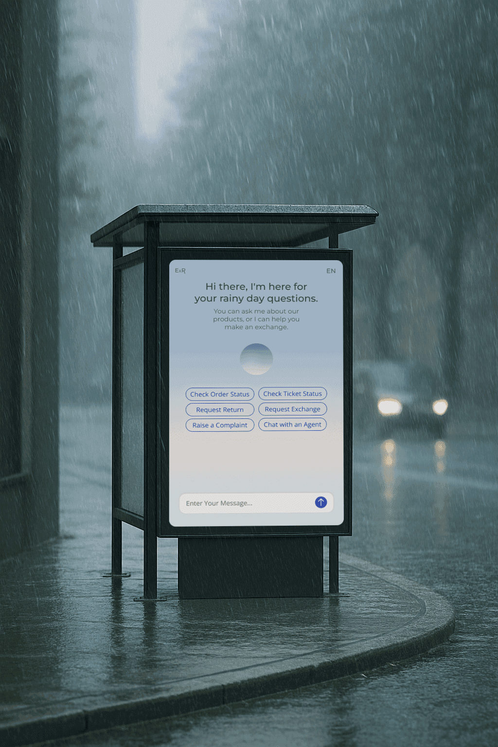
Quick action buttons added
My suggestion to use quick action buttons to reduce typing was implemented, helped streamline user actions reducing user effort and improving task clarity.
Better Visual Hierarchy
The final version adopted several layout adjustments I proposed, including clearer spacing, grouping, and simplified structure to aid readability.
Image support was explored
Early design decisions matter
With rigid systems like LLMs, early design and development alignment is crucial. Once development starts, even small changes become difficult to apply.
Visuals drive usability
Testing proved structure isn't enough. Users rely on clear fonts, spacing, and layout to navigate. Even minor visual improvements increased confidence and ease.
Simplicity builds trust
Short prompts, clear flows, and confirmations made users feel supported. Reducing friction and guidance mattered more than advanced features.
The end
Andrew Paul 2025